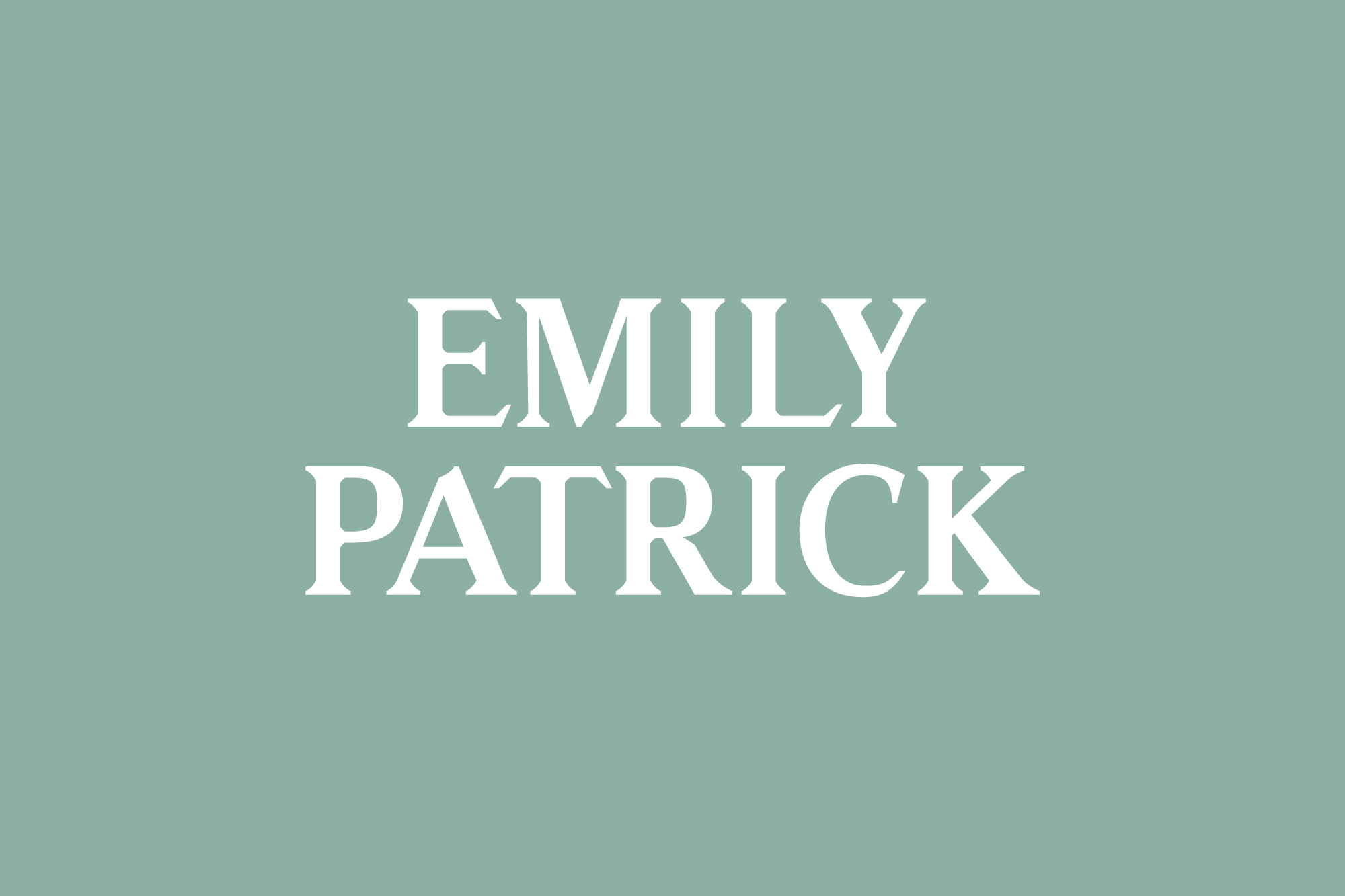
Emily Patrick, Branding & Advertising
Creative Disciplines: Branding, Logo Design, Graphic Design, Advertising, Web Design, Animation
Emily Patrick is a humanist fine artist. Emily is most credited for her Royal commissioned painting of Princess Dianna in 1987. This project is a proposed rebrand, I saw Emily’s exhibition in Mayfair and the caliber of work I saw was truly inspiring, I wanted to propose a rebrand to Emily that would help life the experience of viewing her work both in exhibitions and online.
The Brief
The brief I set myself here was made entirely through conversation through Emily and her husband Michael. Emily throughout the years is still gaining in popularity and drawing in global crowds, with this Emily’s audience is now divided between her new more contemporary audience and her more conservative audience. I feel that Emily’s work has an airy dream-like theme running through it, the colour pallet that is used throughout most of the paintings are all grounded in nature but yet has a certain haze too it that lifts the experience and hints to the unconscious.
The Solution
The current identity uses heavy dark earthy colours and this is nice because it contrasts well with work, but for this proposed identity I wanted the identity to reflect the work, so I selected a range of colours from Emily’s paintings which soon became the actual colour pallet for the new brand, to me it felt right that colours should be selected from Emily’s paintings as it grounded the identity back into the artist and makes for a tighter more considered identity.
I had noticed that in some of Emily’s paintings through painting figuratively in a few cases there was a slight rhythm to her work in that I could see a pattern in straight lines in the texture of the canvas. From this, I created a system of modular patterns that could be applied to packaging and other accessories. This is important because in an identity that is as fine as this one I felt that it is important to not always show Emily’s work throughout the Identity (as tempting as it was) I felt there needed to be a more abstract graphic element to it to help build a more unique interest to the identity.
As Emily is now appealing to a greater more varied audience I felt that the identity needed to be only a step more modern from where currently is at in order to communicate with her newfound audience, the integrity of the original brand needed to remain paramount throughout the identity. This was achieved by keeping to a similar traditional British san serif font but that used more contemporary cuts to the typeface which gave it a hint of modernisum.
In still the logotype manages to be contemporary yet conservative and the mark EP in the circle is hinted to the fact that Emily is a royal commissioned painter (ER). In motion, both the logotype and the mark are both animated to mimic the effect of brush strokes, both Emily, Michael and I agreed that the animation for this is best suited at a slower more refined pace, not only does this pacing add maturity and elegance to the identity it also helps build suspension.
The website both desktop and mobile has been made to be as minimal and as functional as possible to not distract from the work. The website follows the logic of the cubed modular pattern system earlier spoke about in the identity and uses a cubed modular grid to give the website its structure and hierarchy.


