UK Drugs Mortality Data – Infographic
Creative Disciplines: Infographics, Graphic Design
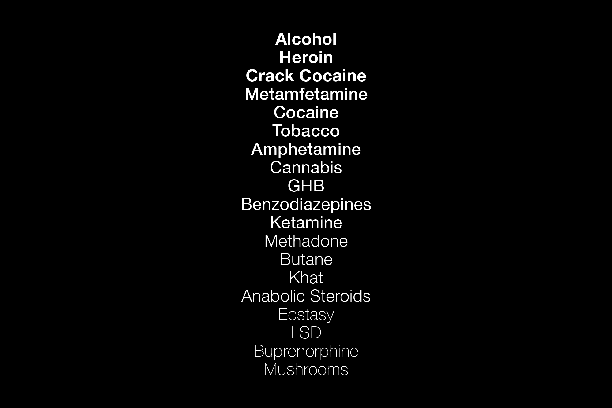
Drugs are something that affects almost everyone in one way or another. It seems to be one of the most talked-about issues week in week out and whether people know the facts or not generally people will have a strong opinion about the subject. This Infographic shows in black and white the facts about the annual UK drug consumption. This data has been sourced from the BBC documentary “Is Alcohol Worse than Ecstasy 2008” with Dr. David Nutt. This Infographic shows three types of data.
Type one – Drugs in order of lethality. In this category, all of the drugs are reclassified according to a collective of 14 of the UK’s most highly respected drug scientists, Including Dr. David Nutt. This includes long term damage to the user, average yearly death rates across the UK, the cost to the NHS and harm to the public.
Type two – Drugs in order of average yearly death rates across the UK.
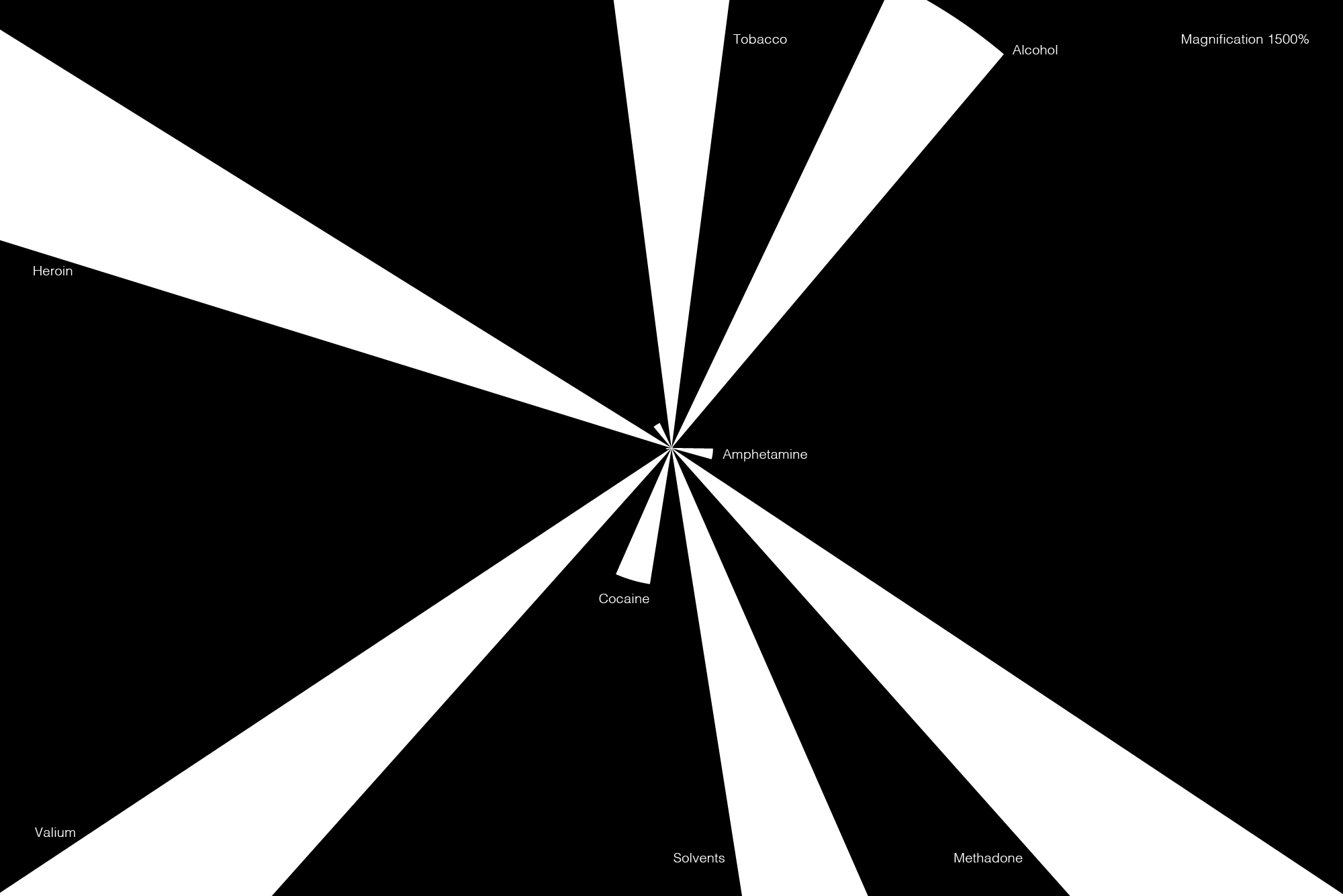
Type three – Drugs relative to a number of users. This is the most interesting data set so far as to my knowledge I haven’t seen this data on this subject created or visualized. In this hypothetical situation, there are the same amount of drug users in each category, therefore making the drugs death ratio relative. In this example, you can see just how lethal a drug is in relative terms.
All data provided by the BBC, all statistics are bases on an average number of deaths per year in the UK. The design of the infographic has been stripped back to its bare elements to allow more of a dialogue on the subject. I did not want to bedazzle the viewer with flashy graphics or motion, this needed to be a piece that was simple and static to allow the user to absorb the information better. Two of the four infographics are using circular shapes to give a more friendly appearance to counter the stark data that is in them.
Type One

Type Two


