DO NOT SLEEP – Branding & Advertising
Creative Disciplines: Branding, Logo Design, Advertising, Design for Print, Iconography, Animation, Signage, Typographic Design
The Brief
I was approached by the promoter Chris Bones to help him and his new team to create the visual identity to his new Ibizan party called do not sleep. Chris had contacted me early on in the concept stage of this project and together we worked out a visual structure and ethos for this identity, the overriding theme through our conversations was that the identity needed to be flexible, memorable and if possible to be able to put the full company name into the logo to help the company in the early stages of brand recognition. The party was initially being aimed at the 18 – 30 British age group due to the initial DJ’s that had been contracted to play for the party, this needed to be considered somewhere in the identity. Ibiza is fast changing with new identities coming through thick and fast, the caliber of competition is high and the identity needed to be impactful from the get-go.
The Solution
The solution here was found in the competition, through cross-examining the various identities throughout the seasons I found that there was a visual gap in the market for something ultra-modern and refined. Do not sleep plays House and Techno music or another way of looking at it is it plays modern dance music and here I found a connection between the modern dance music and the modernist graphic manifesto of 1920’s. The modernist manifesto dictated that to be a true modernist you must eliminate all excess visual noise and you must refine your communication to its essence, much like house and techno music with its minimal approach. Due to the manifesto all text had to be aligned to the left for ease of legibility. Primary colour pallets should be adopted without the use of gradients or effects, in utilizing colour in this way shows strength and confidence in the product through its bold application. The stringent use of geometric shapes was also a founding principle of the movement, this was used because geometric shapes are perfectly symmetrical and create a visual balance. Finally the use of the grid was implemented and with this the use of ‘white space’ was codified and structured, this is to say that a piece of design whether it be a poster or a business card does not need to have every inch of space taken up with graphic elements and photos, white space was recognized as a graphic element and became apart of the modern designers tool kit.
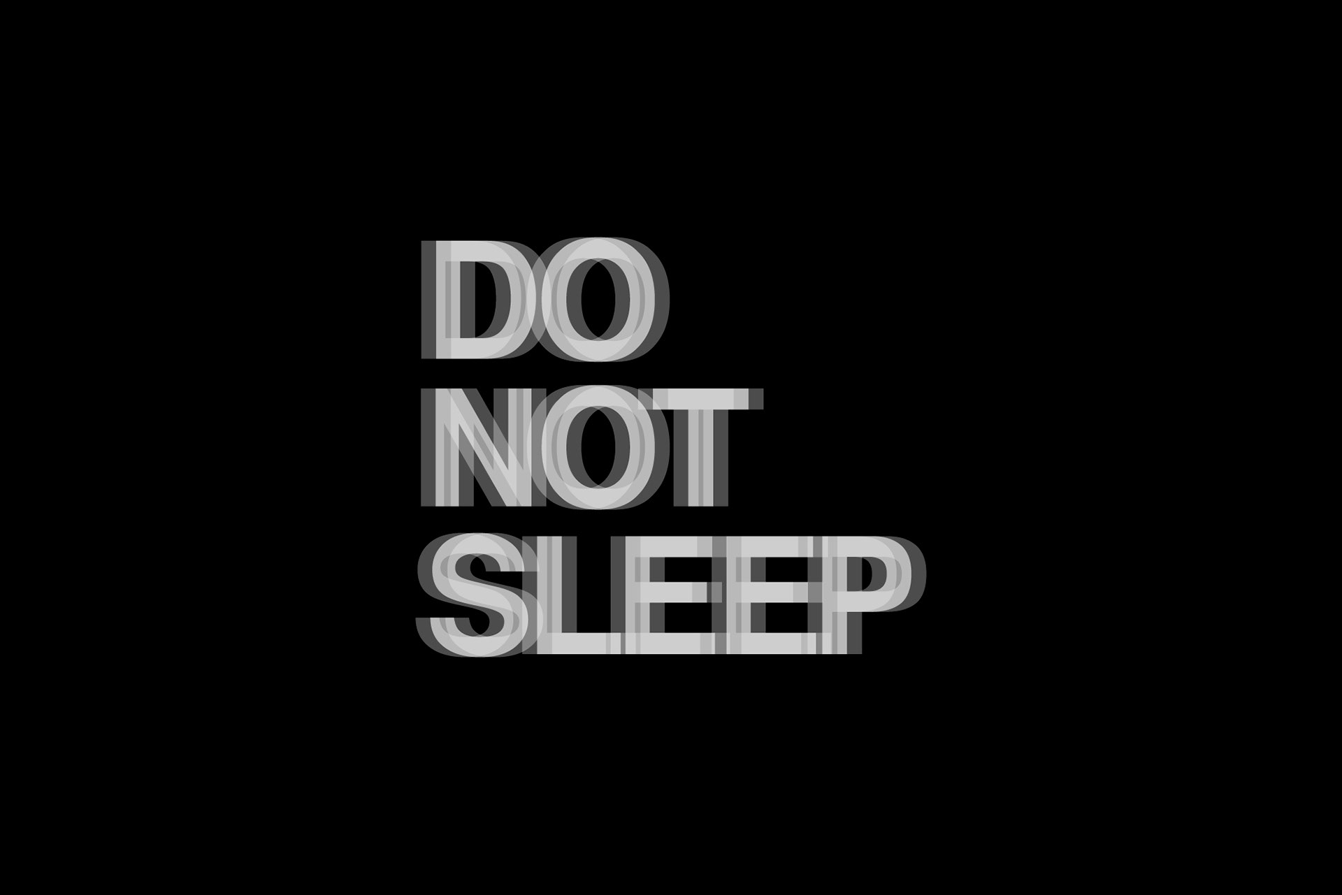
In designing the logo and identity for do not sleep I stuck to the above rules religiously, through the restriction of the manifesto came creativity. The logotype was set in Helvetica, the most popular san serif typeface of the period, in full capitals and aligned to the left. This naturally created a corner on the top left-hand side of the logotype, so I explored this natural visual theme and created a system of communication where any written text should appear to be written from this corner and kept to a minimum.
The entire identity is set in black and white, this was applied strictly as I wanted to not only follow the manifesto but I also wanted to create a different feel to the clubbing experience. In thinking about how the identity would be applied to Privilege Ibiza (formerly known as KU club) nightclub I wanted wanted the identity to take a back seat here and to not hold too much attention so that people could then not have there attention divided by flashing use of colour and that they would be able to more naturally focus on the music and the companionship of the other people on the dance floor.
The identity gets its key characteristic from its distortion, I wanted the identity to have a real Ibizan theme too it, I wanted to make people feel that by merely looking at the logo they felt like they were in the nightclub, so the logo was given a distorted effect to replicate the feeling of for want of a better phrase having one too many. Whilst the mere thought of this for some may create a visceral reaction what I love about this is that it was honest, it was relatable to its target market and it sets a very bold tone of voice. Since the identity was published it has helped brands such as Selfridges, Mac cosmetics and many other global brands find inspiration In creating their seasonal identities.
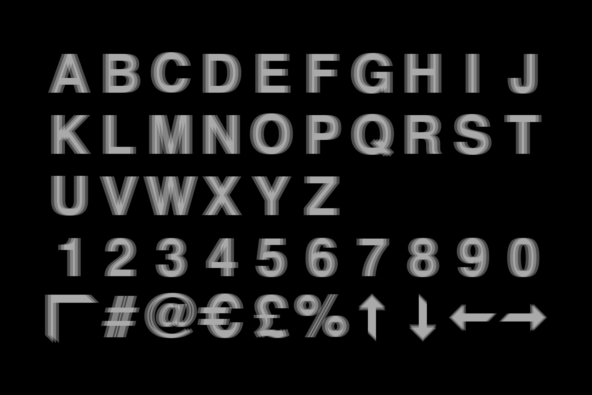
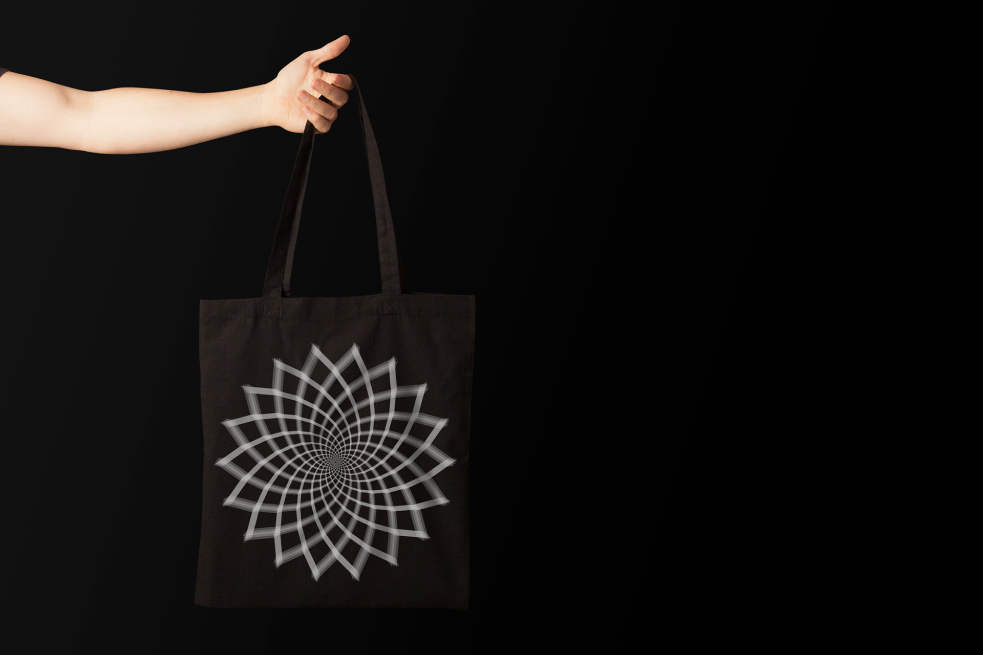
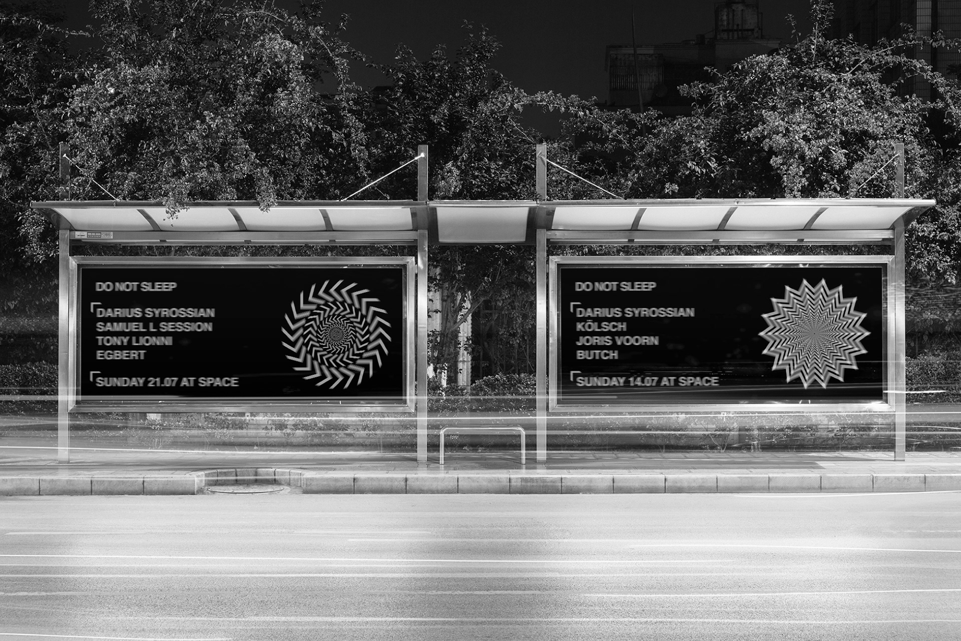
Do not sleep’s strength comes from the fact that you do not need to see the logo to understand that you are looking at a do not sleep advert, this was helped by a bespoke typeface and pattern system which follows the same logic as the logotype. The identity up until the pattern system is introduced is modern and masculine leaning but it needed to be juxtaposed with something a touch more organic, so I created a set of abstract flowers from the type introduction symbol to give it a bit more of a natural more feminine feel.
Since do not sleep launched in the summer of 2014 the party has year on year moved to larger venues on the island drawing larger crowds and has now become a global brand in party promotions playing from Miami to Ibiza and is now also a successful record label.
